


Is your room always messy despite you making a mental note to keep it tidy and organized? Does your living space become cluttered all over again only a few days after tidying it? And do you hate it? You probably do. This curse of having things all over the place is something that the majority dislikes. And wants to fix. But mostly they don’t know how to. Anything changes that they do make become lost to routine and the demands of everyday life. Data generated in your conference works similarly. No event planner enjoys having to work with information that’s in disarray. Information gets held up in silos and the team is left scatterbrained in trying to simply make sense of operations.
So, when such mayhem is a customary part of your conference planning, excellence is far-fetched. And organization, quite literally, is lost. A conference operations dashboard can help you tackle this. A real-time conference dashboard allows all team members with access to keep tabs on progress across key operations like registration, ticketing and attendee communications without relying on a manual middleman to pass information along. A conference operations dashboard can make your event organization effectively boundaryless, therefore making details attainable across hierarchical levels.
What Is a Conference Operations Dashboard?
A conference operations dashboard is a centralized, systematic setup that allows teams to keep track of event operations metrics across the entire lifecycle. Conference teams often confuse an operations dashboard with other tools that look similar on the surface but in functionality, they are vastly different altogether. The term conference management dashboard or event operations dashboard gets thrown around fairly. Here’s what dashboards are and what they do:
| Dashboard Type | Primary Purpose |
| Marketing dashboard | Campaign performance |
| Financial dashboard | Revenue and expenses |
| Analytics dashboard | Event performance |
| Operations dashboard | What requires action now |
| Executive dashboard | High-level event health |
Why Conference Teams Need an Operations Dashboard
Most conference teams do not lack data. They lack a single place to see it, and that gap causes damage in fairly predictable ways once an event grows past a certain size.
Data scattered across systems means nobody has a complete picture, and staff working from different spreadsheets often make decisions based on numbers that already went stale days earlier. Deadlines get missed not because nobody cared, but because nobody was actually watching the specific number that mattered until it was already too late to act on it. Reviewer assignments fall behind schedule quietly, speakers stay unconfirmed longer than anyone realizes and registration problems surface only once an attendee shows up confused at check-in rather than weeks earlier when a fix would have been easy.
Payment reconciliation issues, last-minute schedule conflicts and overlooked sponsor deliverables all follow the same pattern. Each one starts as a small gap between what the team assumes is true and what is actually true, and that gap widens every day it stays invisible. A useful way to think about the whole problem is as a simple operating chain: data leads to visibility, visibility surfaces an exception, an exception needs an owner and an owner takes the required action. Break any single link in that chain, and the conference operations dashboard stops doing its job regardless of how good the underlying data looks.
Start With Decisions, Not Metrics
Here is where most dashboard efforts go wrong from the very beginning, and it is worth treating as the central idea of this entire guide. Teams tend to start by listing every event operations metric they could possibly track, then build a dashboard crowded with numbers nobody actually uses to decide anything. A better approach reverses the order entirely. Organizers should start with the decisions the team has to make every single day, then work backward to identify the minimum data needed to support each one.
| Decision | Supporting Metric |
| Increase promotion? | Registration pace |
| Add reviewers? | Outstanding reviews |
| Chase speakers? | Confirmation status |
| Change room? | Session capacity |
| Contact attendee? | Failed payment |
| Add check-in staff? | Expected arrival volume |
Notice what this table does not include. It has no vanity numbers, no event operations metrics included purely because they were easy to pull out of a report. Every row ties directly to an action someone on the team will actually take. Registration pace tells a marketing lead whether promotion needs a push this week. Outstanding review counts tell a review chair whether more reviewers need recruiting before the deadline slips. This decisions-first approach is what separates a conference operations dashboard that actually drives behavior from one that simply decorates a wall.
The 8 Areas Your Conference Dashboard Should Track
Once the decision-first mindset is set, the next step is mapping out the specific areas a conference metrics dashboard needs to cover. Eight categories account for nearly everything a conference team manages, and each one deserves its own section of the dashboard rather than getting buried inside a general summary.
1. Registration
Registration data anchors the entire dashboard, since it usually drives revenue projections, catering counts and staffing decisions all at once. Track total registrations against the registration target, along with registration pace measured week over week, and watch the ticket type mix to see whether higher-value tickets are selling at the expected rate. Cancellations, incomplete registrations and waitlisted attendees each deserve their own line, and registration source helps a marketing team see which channel is actually converting rather than just generating clicks.
A simple formula worth building into this section: completed registrations divided by started registrations, multiplied by one hundred. A low completion rate almost always points to a checkout problem worth fixing immediately rather than a demand problem worth worrying about.
2. Revenue and Payments
Gross registration revenue and paid orders establish the baseline, but the numbers that actually demand attention are the exceptions sitting underneath them. Unpaid invoices, failed payments, refunds and discounts issued all deserve visibility, along with sponsorship revenue tracked separately from registration revenue and outstanding balances broken out by how overdue they are. Prioritize the financial exceptions requiring real intervention over the totals that simply confirm what everyone already expected.
3. Abstract Submissions
Abstracts received, submissions broken down by track, incomplete submissions and withdrawn abstracts all belong here, alongside counts for abstracts awaiting review, accepted abstracts and rejected abstracts. A useful visualization walks the pipeline in order: submitted, assigned, reviewed, decision made, confirmed. Seeing where submissions bottleneck inside that pipeline is often more valuable than any single total number on its own.
4. Peer Review Progress
Reviewer invitations sent, reviewers who accepted, papers assigned and reviews completed all feed into this section, but overdue reviews deserve the most prominent placement on the page. Average reviews per abstract and reviewer workload help a review chair spot an imbalance before it becomes a bottleneck, and conflicts of interest need their own visible flag rather than sitting buried in a footnote. Abstracts lacking sufficient reviews should surface automatically rather than requiring someone to go looking for them.
The formula here mirrors the registration one: completed reviews divided by assigned reviews, multiplied by one hundred, gives a clean completion percentage worth watching daily as a deadline approaches.
5. Speakers and Presenters
Invited speakers and confirmed speakers set the baseline, but the exceptions matter more day to day: missing biographies, missing headshots and presentation files still outstanding close to the event. Speaker registration status, travel requirements, withdrawals and replacement speakers round out the picture, and any speaker missing more than one of these items should stand out clearly rather than blending into a general list.
6. Programme and Sessions
Sessions scheduled against sessions still unscheduled gives an immediate sense of programme completeness, and room assignments checked against room capacities catch a mismatch before it becomes an on-site problem. Scheduling conflicts need their own dedicated view, since a double-booked room or speaker rarely gets caught by scanning a general schedule. Moderators assigned, session chairs confirmed, cancelled sessions and programme changes round out this category. A single programme readiness percentage, combining several of these indicators into one number, gives leadership a fast read without requiring them to dig into every individual metric.
7. Sponsors and Exhibitors
Sponsorship packages sold and outstanding payments establish the commercial picture. Logo received, booth assignment and exhibitor registrations track the operational side of sponsor fulfillment separately. Sponsor assets received, sponsored sessions confirmed and lead retrieval requirements round out a section that gets overlooked more often than any other on this list, usually because sponsor deliverables sit outside the core registration and programme workflow most teams check daily.
8. Attendee Operations
Checked-in attendees, badge printing status and session check-ins cover the basics of on-site tracking. Help desk requests reveal where attendees are actually struggling in real time. Meal requirements and accessibility requirements need visibility well before the event starts, not discovered on site, and mobile app adoption alongside session capacity data helps staff catch a room running over capacity before it becomes a safety issue. Attendance anomalies, sudden drops or spikes against expected numbers, often point to a problem worth investigating immediately rather than filing away for a post-event report.
Build a Conference Operations Dashboard KPI Framework
Tracking eight categories of data only helps if the dashboard organizes that data in a way that stays genuinely actionable rather than decorative. Three layers keep a conference KPI dashboard honest about what it is actually for.
| Layer | Question | Examples |
| Health | Is the conference on target? | Registration progress, revenue progress, programme readiness |
| Risk | Where could something go wrong? | Overdue reviews, unconfirmed speakers, unpaid invoices |
| Action | What must someone do now? | Send reviewer reminders, chase files, resolve failed payments |
Health metrics answer whether the conference sits on target overall, covering registration progress, revenue progress and programme readiness at a glance. Risk metrics go a level deeper, surfacing exactly where something could go wrong before it actually does, covering overdue reviews, unconfirmed speakers and unpaid invoices. Action metrics close the loop entirely, stating plainly what someone needs to do right now, whether that means sending reviewer reminders, chasing missing files or resolving a failed payment before it turns into a cancelled registration.
A dashboard missing the action layer tends to leave a team informed but stuck, aware that reviews are overdue without any clear next step attached to that awareness. Building all three layers into a conference operations dashboard from the start is what keeps it a working tool rather than a passive report nobody consults until something has already gone wrong.
Use Red, Amber and Green Status Indicators
Numbers alone rarely communicate urgency fast enough during a busy planning cycle. A simple color system does that work instantly, letting a staff member glance at a screen and know within a second whether something needs attention.
| Metric | Green | Amber | Red |
| Reviews completed | Above 90% | 70 to 90% | Below 70% |
| Speakers confirmed | Above 95% | 80 to 95% | Below 80% |
| Registration target | Above 90% | 70 to 90% | Below 70% |
These specific thresholds work as a starting point rather than a fixed rule, and any team adopting them should adjust based on timing, event size and conference type. A ninety percent review completion rate might count as healthy six months out, but the same number three weeks before the event probably belongs in amber or red instead, since the remaining reviews carry far more urgency as the deadline closes in.
Assign Every Operational Metric an Owner
A metric with no owner tends to sit on a dashboard looking important even as nobody actually does anything about it. Assigning clear ownership is what turns a passive report into a working operations tool.
| Dashboard Area | Owner |
| Registration | Registration manager |
| Abstracts | Scientific committee |
| Reviews | Review chair |
| Speakers | Programme manager |
| Sponsors | Sponsorship manager |
| Payments | Finance |
| Venue | Operations |
| Communications | Marketing |
This ownership structure does not need to be complicated, but it does need to be explicit and shared with the whole team rather than assumed. Treating conference management KPIs as owned assignments rather than shared responsibilities is what keeps this structure from quietly falling apart. The key principle worth repeating here: a dashboard without ownership becomes a reporting tool rather than an operations tool, and that distinction matters more than almost any design choice covered elsewhere in this guide.
Design Your Conference Operations Dashboard for Exceptions
A dashboard covering every metric equally, with no visual hierarchy separating routine numbers from urgent ones, forces staff to hunt for problems buried inside a wall of green. Designing specifically for exceptions flips that arrangement, surfacing what needs attention rather than burying it.
A handful of exception categories cover nearly every situation worth flagging: items needing attention, items overdue, items missing entirely, items unassigned, payments that failed, anything at risk of slipping, items due today and items due within the week. Structuring a dashboard around these categories, rather than a flat list of every tracked metric, is what makes it usable under real time pressure rather than only in a calm planning meeting.
A useful example widget makes this concrete: Peer Review, 92 percent complete, 17 overdue, 4 unassigned, with a clear action attached reading send reviewer reminders. That single widget tells a review chair everything needed to act within seconds, which is precisely the standard every widget on a well-designed conference operations dashboard should meet.
What Your Dashboard Should Look Like Before the Conference
A conference operations dashboard should not look the same in month one as it does in week one, since the decisions that matter most shift dramatically across the planning cycle. A conference planning dashboard built for the early stage looks noticeably different from the one a team relies on the week before doors open.
| Stage | Primary Focus |
| 6 to 12 months before | Submissions, sponsorship, registrations, speakers |
| 3 to 6 months before | Reviews, decisions, programme, speaker confirmation |
| Final 30 days | Payments, presentation files, badges, room assignments, sponsor assets, staff tasks |
Early on, the dashboard should emphasize submissions, sponsorship sales, registration pace and speaker outreach, since these areas set the foundation everything else depends on. As the event moves closer, attention shifts toward review completion, acceptance decisions, programme construction and speaker confirmation. In the final thirty days, the dashboard should narrow sharply toward execution details: payment collection, presentation files, badge preparation, room assignments, sponsor asset collection and the daily staff task list that keeps everything on schedule.
What to Track During the Conference
Once the event itself begins, the operating rhythm changes entirely, and a conference operations dashboard needs to shift alongside it. Check-ins, no-shows and session attendance become the numbers worth watching minute to minute rather than day to day. Room capacity needs live monitoring so staff can react before a popular session becomes a fire hazard rather than after, and badge printing status matters most exactly where a queue is forming at that moment.
Cancellations and programme changes need immediate visibility, since attendees standing in the wrong room because of an unannounced room swap creates a poor experience that a live dashboard should prevent rather than explain afterward. Help desk requests reveal patterns worth acting on in real time, and speaker arrivals confirmed against the schedule catch a missing presenter with enough runway to adjust the programme gracefully. App activity data rounds out this picture, showing whether attendees are actually engaging with session content pushed out on the mobile app during the event itself.
This live phase is often described as an Event Command Center Dashboard, a real-time conference dashboard mode built specifically for real-time operational control rather than the planning-oriented view used in the months leading up to the event.
What to Track After the Conference
The dashboard’s job does not end when the last session wraps up. Final attendance numbers, outstanding payments still owed and refunds still processing all need closing out cleanly, and certificates for continuing education or professional credit need issuing accurately and promptly.
Survey responses collected after the event feed directly into next year’s planning, and session attendance data reviewed after the fact reveals which topics genuinely drew a crowd versus which ones looked strong on paper but underperformed in the room. Sponsor reports need compiling and sending soon, when the relationship is still fresh, and any continuing education or continuing medical education credits tied to specific sessions need final verification. A clear list of post-event tasks, assigned to specific owners the same way live and pre-event metrics were, keeps this closing phase from dragging on for weeks after everyone else has mentally moved on to the next event.
How Often Should Conference Dashboards Update?
Update frequency should match the pace of decisions being made at each stage, not stay fixed at a single cadence throughout the entire planning cycle.
| Lifecycle Stage | Suggested Cadence |
| Early planning | Weekly |
| Registration period | Daily |
| Final month | Multiple times a day where necessary |
| Event days | Real time or near real time |
| Post-event | Daily until reconciliation is complete |
Weekly updates suit early planning, when most numbers move slowly and daily checks would waste more time than they save. Daily updates make sense once registration opens and the pace of change picks up noticeably. In the final month, some numbers deserve checking multiple times a day, particularly payment status and outstanding tasks with a hard deadline attached. During the event itself, real time or close to it becomes the standard, since a same-day problem needs a same-hour response. After the event, daily monitoring until reconciliation closes out keeps the tail end of the process from stretching longer than it needs to.
Common Conference Dashboard Mistakes
A handful of recurring mistakes explain why many dashboard efforts stall out after an initial burst of enthusiasm.
- Tracking too many metrics, until the dashboard becomes noise rather than a filter
- Leaning on vanity metrics that look good but never drive an actual decision
- Leaving metrics without a clear owner attached to each one
- Skipping alert thresholds, so nothing actually flags when a number crosses into dangerous territory
- Mixing analytics and operations together on the same view, blurring what happened with what needs doing now
- Depending on manually updated spreadsheets that go stale within days of the last update
- Showing raw totals with no context for whether that number is good, bad or simply normal
- Using one static dashboard design across the entire lifecycle instead of adjusting it stage by stage
- Ignoring data quality issues that quietly undermine every number built on top of them
- Failing to state the required action clearly, leaving a team informed but not actually equipped to respond
Avoiding this list matters considerably more than adding any single clever new metric, since a dashboard undermined by even one of these mistakes tends to lose a team’s trust quickly, and a dashboard nobody trusts stops getting checked at all.
Spreadsheet Dashboard vs Integrated Conference Platform
Many teams start with a spreadsheet, and that choice makes sense early on when data volume stays low and manual updates remain manageable. The tradeoffs become clearer once an event grows past a certain size.
| Capability | Spreadsheet | Integrated Platform |
| Real-time data | Limited | Yes |
| Abstract status | Manual | Automatic |
| Registration | Import required | Connected |
| Review progress | Manual | Connected |
| Speaker status | Manual | Connected |
| Payments | Separate | Connected |
| Permissions | Limited | Role-based |
| Alerts | Difficult | Automated |
| Audit trail | Limited | Available |
A spreadsheet can absolutely function as a conference operations dashboard for a small, simple event, and there is no need to abandon one just because a more sophisticated option exists. The tradeoff becomes real once registration volume, abstract counts and speaker rosters climb into the hundreds, since manual updates start consuming staff hours that could go toward actually resolving the exceptions the dashboard is supposed to surface in the first place. An integrated conference management software platform removes that manual layer entirely, connecting registration, abstract management and other operational data automatically rather than requiring someone to copy numbers between systems by hand.
How Dryfta Supports Conference Operations
Everything covered so far describes what a conference operations dashboard should do in principle. Making it work day to day, across an entire event lifecycle and without constant manual upkeep, is where the underlying platform actually matters.
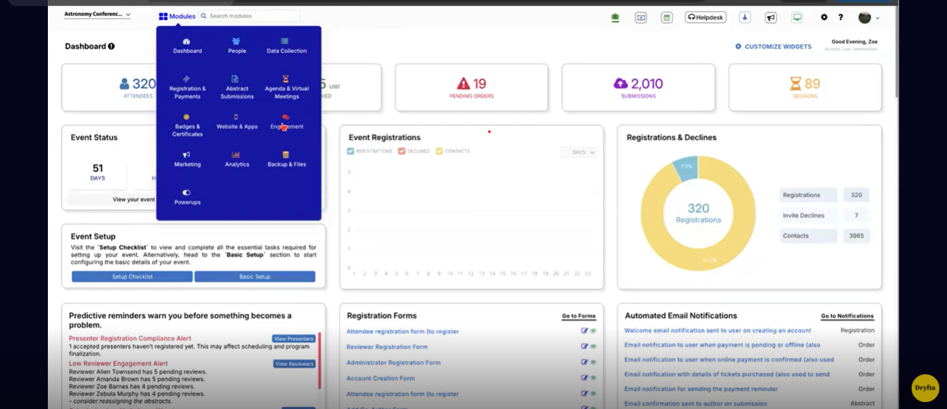
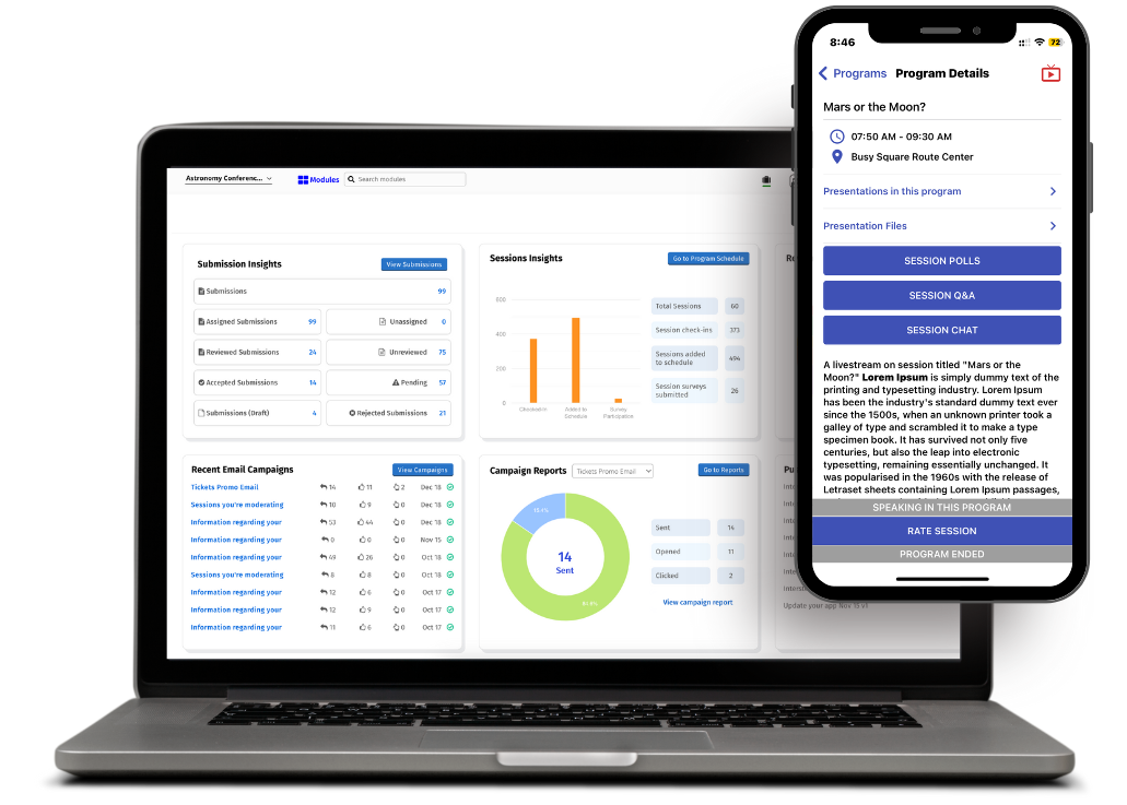
Dryfta connects registrations, abstracts, peer reviews, speakers, schedules, sponsors, exhibitors, communications and reporting inside one smart CRM platform. When a review gets completed, that status change shows up on a self-service dashboard immediately in the same place a registration manager, a programme chair and a finance lead are all already looking, so nobody has to chase an update across five different inboxes.
Connected data removes the duplicate status tracking that eats up so much staff time on a spreadsheet-driven approach, since a single change in one part of the system updates every dependent view automatically. What amounts to a conference reporting dashboard sits directly on top of the same operational data, and Dryfta’s Event Analytics & Reporting tools build directly on top of this same connected data, giving teams the deeper reporting and custom analysis a pure operations dashboard is not designed to provide on its own, without requiring a separate export and reconciliation step to get there.
Behind the operations view sits the full platform: abstract management and peer review workflows, registration and event registration tools, conference scheduling for the programme itself, speaker management for confirmation and file collection, an event CRM for attendee communication, event check-in for on-site operations and a mobile app that keeps attendees connected to live programme changes. Seeing how these pieces connect inside a single system is often the fastest way to understand why a spreadsheet-based approach eventually runs out of room to grow. See how Dryfta can centralize your conference operations.
Conference Operations Dashboard Checklist
A short, printable checklist makes it easier to confirm a dashboard actually covers the ground this guide has walked across, area by area.
| Area | Checklist Items |
| Registration | Target, pace, incomplete registrations |
| Abstracts | Submitted, under review, decisions pending |
| Reviewers | Assigned, completed, overdue |
| Speakers | Confirmed, missing files, missing registration |
| Programme | Sessions scheduled, conflicts, room assignments |
| Finance | Revenue, outstanding payments, refunds |
| Operations | Check-ins, badge status, open issues |
Running down this checklist before an event opens for registration, and again roughly a month out, catches gaps early enough to fix them without scrambling. Many teams find it useful to turn a version of this table into a shared, one-page reference the whole staff can check without needing to reread the full guide each time.
Example Conference Operations Dashboard
Seeing a worked example makes all of the abstract guidance above easier to picture in practice. Imagine a mid-size academic conference roughly a month out from its opening day.
| Registrations | Reviews Complete | Revenue | Programme Ready |
| 1,842 | 94% | $287K | 91% |
Underneath that top row, a Needs Attention panel does the real work: 17 overdue reviews, 8 unconfirmed speakers, 24 unpaid invoices, 6 scheduling conflicts and 13 missing presentations. None of those five numbers sit buried in a general report. Each one names a specific exception with an owner already assigned, ready for that owner to act on the same day rather than discovering the issue during a status meeting a week later.
A supporting visual row rounds out the view, typically showing a registration trend line alongside the submission pipeline and a programme readiness gauge, giving leadership a fast, glanceable read of where the event actually stands without requiring anyone to open a single spreadsheet.
Frequently Asked Questions (FAQs)
What is a conference operations dashboard?
A conference operations dashboard is a centralized view of the metrics, tasks, deadlines and exceptions organizers need to monitor when planning and delivering a conference. Some teams call this same tool an event operations dashboard instead, and the two terms describe the same underlying idea. It differs from a general analytics dashboard by focusing specifically on what needs action right now rather than summarizing what already happened.
What should a conference dashboard include?
A complete conference management dashboard should cover registration, revenue and payments, abstract submissions, peer review progress, speakers and presenters, programme and sessions, sponsors and exhibitors, and attendee operations. Each area should surface exceptions clearly rather than only showing totals.
Which conference KPIs should organizers track?
The right conference KPIs depend on the decisions a team actually needs to make, not a generic list pulled from another event. Registration pace, review completion rate, speaker confirmation status, programme readiness and outstanding payments cover most of the decisions that come up daily across a typical event.
How often should an event dashboard be updated?
Update frequency should shift with the planning stage. Weekly updates suit early planning, daily updates suit the registration period, several updates a day suit the final month and real-time or near-real-time updates suit the event itself. Post-event tracking should continue daily until financial reconciliation is complete.
Can I build a conference dashboard in Excel?
Yes, particularly for a smaller event with modest registration volume and a simple programme. A spreadsheet becomes harder to sustain once registration, abstract and speaker counts climb into the hundreds, since manual updates start consuming time better spent resolving the exceptions the dashboard exists to surface.
What is the difference between an event analytics dashboard and an operations dashboard?
An analytics dashboard explains how an event performed, covering metrics such as marketing reach, attendance trends and audience participation over time. This is different from a conference performance dashboard used strictly for operational monitoring, since an operations dashboard asks a narrower, more immediate question: what needs action today. The two serve different purposes and generally work best as separate, complementary views rather than one dashboard trying to do both jobs at once.
How do you track conference planning progress?
Effective tracking combines a lifecycle view, showing what matters most at each stage from early planning across to the final thirty days, with red, amber and green status indicators that flag risk before it becomes a missed deadline. Assigning clear ownership to each metric keeps that tracking connected to actual follow-up rather than a passive report nobody actions.
Can conference management software create real-time dashboards?
Yes, provided the underlying platform connects registration, abstract, review, speaker and programme data automatically rather than requiring manual exports between separate tools. That connection is exactly what allows a dashboard to update in real time rather than only as often as someone remembers to refresh a spreadsheet by hand.
Final Thoughts
A strong conference operations dashboard does more than tell organizers what already happened. It shows what is happening right now, what has drifted off track, who owns each piece of it and what needs to happen next, and that shift from reporting to action is the entire point of building one in the first place. Whether a team calls it an event organizer dashboard or something else internally, the underlying discipline stays the same. Learning how to build a conference operations dashboard is ultimately less about picking the right software and more about deciding, deliberately, which decisions matter most and which numbers actually support them.
Dryfta’s connected data model, spanning registration across to reporting, gives that decision-first approach an actual foundation to run on, rather than leaving a team to rebuild the same manual view from scratch before every single event. If you are ready to to see how this connected approach can look like in practice, sign up for a free demo with us today.