
At 9:00 a.m., the poster hall opens. One visitor finds a poster whose body text disappears from two metres away. Another reaches a chart that separates its data only by red and green. A third scans the QR code and lands on an image-only PDF that a screen reader cannot interpret. The conference has covered size and mounting, but it has not issued accessible scientific poster guidelines or explained what organizers will check.
Accessible scientific poster guidelines should cover the real viewing distance, readable text, clear contrast, non-colour cues, a logical reading order, labelled figures and an accessible version containing the poster’s essential content. Organizers should publish those requirements before presenters begin designing, test the digital access route and review files early enough to request corrections before printing.
This is an organizer’s job, not a last-minute favour from individual presenters. A useful policy tells authors what to provide, explains how the conference will check it and names the route for questions or exceptions. It also separates three things that often get mixed together: the printed poster, the digital alternative and the presenter’s interaction with visitors.
This guide stays with those requirements and checks. For venue access, registration questions and attendee support, use the broader guide to improving accessibility across the whole event.
Start with the room, not a font-size rule
Poster instructions often begin with a page size and stop there. Accessibility depends on the conditions in which people will read the result, so the conference should first document the viewing environment:
- State the permitted poster dimensions and orientation.
- Describe the likely viewing distance and how crowded the hall becomes.
- Check lighting, reflections and glare at the display boards.
- Set a mounting range that keeps essential content within reach and sight.
- Keep an accessible approach route to each board.
- Say whether the poster will also appear online.
- Specify the digital alternative and when the presenter must submit it.
These details give numeric requirements a purpose. A body-text minimum that works on a small tabletop display may fail on an A0 poster viewed across a busy aisle. Some professional bodies publish useful example sizes, but no single number fits every board, format and room. If your conference sets minimum type sizes, print a representative poster at actual size, view it under comparable lighting and ask a qualified accessibility reviewer to validate the requirement.
Give every poster a clear reading path
A visitor should not have to guess whether to read down a column, across a row or around a central figure. Ask presenters to use a recognizable structure that fits their discipline, such as title, purpose, method, results and conclusion. The order should remain clear even when the visitor cannot take in the whole poster at once.
Require descriptive headings and a predictable column sequence. If a layout has an unusual path, number the sections or add another explicit cue. Keep paragraphs short, leave visible space between sections and include a concise statement of the main finding. Contact details should use real text or a clearly labelled link rather than an unexplained icon.
Consider a three-column poster in which the middle column starts with the conclusion, the left column continues into the bottom-right panel and arrows cross behind a chart. It may look dynamic from a distance, but the reading order becomes work. The organizer does not need to prescribe one visual layout. The requirement can simply ask the author to show the intended sequence and test whether someone unfamiliar with the study can follow it.
Keep this requirement about comprehension. Authors who need help with visual composition can use Dryfta’s separate guide to improve the general visual design of a research poster.
Make the essential text readable
A poster is not a paper enlarged to fit a board. Ask presenters to keep the central argument, the evidence needed to understand it and a short route to further detail. Dense methods and supporting results can sit in the accessible digital version.
The poster itself needs a clear hierarchy between the title, section headings, body text, labels and captions. Typefaces and styles should remain consistent. Lines should not run so long that readers lose their place, and spacing should separate ideas instead of compressing them. Uncommon abbreviations need expansion on first use. Important text should remain real text in the digital file rather than being flattened into a low-resolution image.
Do not tell presenters to use 12-point Times New Roman for a full conference poster. That convention belongs to manuscript-style documents and does not account for poster viewing distance. Ask for an actual-size proof instead. Place it at the expected height, step back to the normal viewing position and check the title, body text, figure labels, legends and contact route. A monitor preview cannot reproduce that test.
Use contrast and more than colour to carry meaning
Text and graphics need enough light-dark contrast to remain distinguishable. Avoid text over photographs, gradients or patterned backgrounds. In charts, add direct labels, symbols, line styles or patterns so that colour is never the only way to identify a series or status.
WCAG 2.2 gives testable criteria for digital content, including use of colour, text contrast and non-text contrast. Apply those criteria to the online alternative and other digital assets. They can also inform poster design, but they do not certify a physical poster. Paper, ink, print quality and hall lighting change the result, so a printed proof still needs human review.
A contrast checker and a colour-vision simulator can reveal specific problems. Neither tool can confirm that the poster as a whole works. The reviewer should also check whether labels remain connected to the correct data, whether the reading order makes sense and whether the main finding is understandable without relying on colour.
Make charts, diagrams and images understandable
Charts often carry the main result, yet they also collect the most accessibility problems. Require descriptive chart and axis titles, units, scales and sample sizes where they matter. Direct labels usually reduce the effort of moving between a legend and the data. Captions should state the point of the figure, not stop at “Figure 1.”
The digital version needs meaningful text alternatives. The right description depends on the purpose of the figure. A simple photograph may need one concise sentence. A graph may need a short alternative that states the takeaway plus a longer description or data table that preserves the values. W3C’s alt-text decision tree makes an important distinction: complex information should also appear elsewhere in an accessible form instead of being forced into an oversized alt attribute.
Give presenters a concrete question to answer: “What would a reader miss if this visual were unavailable?” The answer identifies what the text alternative must communicate. Do not ask them to describe every pixel, and do not accept “graph of results” when the graph contains the study’s main conclusion.
Require a usable digital alternative
The printed poster cannot meet every access need on its own. Each accepted poster should therefore have a digital route to the same essential research. The conference can allow more than one format, provided it defines what must be checked.
| Alternative | Useful strength | What the organizer must verify |
|---|---|---|
| Tagged PDF | Preserves a document version of the poster | Real text, tags, reading order, headings, links and figure alternatives |
| Structured HTML page | Adapts well to screen size and assistive technology | Heading order, keyboard access, link purpose, image alternatives and responsive layout |
| Structured text with figures | Offers a practical route when time or tools are limited | Complete essential content, clear headings and meaningful figure descriptions |
| Audio or video overview | Adds another way to understand the work | Captions, transcript, usable controls and a text-based route to the same information |
An image-only PDF is not an accessible alternative. A tagged PDF can work, but tags alone are not enough. The conference should check the reading sequence, headings, links and figure descriptions. W3C’s PDF reading-order technique explains why a visually clear multi-column document can become confusing when its tag order is wrong.
The University of Hamburg shows one practical model: a QR code on the poster opens a structured alternative containing the title, an overview of a complex layout and descriptions of each content block. Its poster alternative-text guidance also recommends data tables and written trends for complex charts. Treat that as a workable example, not a universal template.
Make the QR code work in the hall
A digital alternative helps only when visitors can reach it. Put the QR code in a consistent, easy-to-find position. Give it strong contrast and enough printed size for the expected scanning distance. Keep the required quiet space around it and place a human-readable short link beside it.
Use a descriptive label such as “Read the accessible version,” not “Scan me.” Send visitors directly to the resource without an unnecessary login, tracking wall or multi-step menu. Keep the destination stable for the period promised by the conference.
Test the printed code on several phones, with more than one camera app and on the venue network. Test the short link by typing it rather than copying it. At a final hall check, scan a poster from the likely standing position. If connectivity is uncertain, provide an offline copy or a staffed help route. Broader network planning belongs in the separate guide to reliable conference Wi-Fi.
Train presenters to help without making them the access plan
A presenter can make the session easier to use, but the presenter must not become the only way to access the research. Ask presenters to:
- Introduce the poster’s structure and main finding aloud.
- Describe important visuals instead of pointing without explanation.
- Repeat a question when background noise makes it difficult to follow.
- Keep the poster and approach route clear.
- Know where visitors can find the accessible version.
- Share the organizer’s contact route for later access questions.
A visitor may arrive when the presenter has stepped away or may prefer to explore independently. The poster and its alternative should still work. A short presenter briefing sent with the acceptance notice can explain these expectations without turning them into another lengthy policy.
Review before printing, while authors can still fix problems
The strongest requirement fails if nobody checks the result. Build the review into the poster timeline:
For a large poster programme, use risk-based triage without losing the minimum check. Review every access link and digital alternative, then give extra attention to posters with dense multi-column layouts, complex figures, colour-dependent data or unresolved checker warnings. A short pilot with five to ten early submissions will expose unclear instructions before hundreds of authors repeat the same mistake.
- Publish the requirements with the call for posters or acceptance notice.
- Offer a source template only after an accessibility reviewer has tested it.
- Collect a draft and the digital alternative before the print deadline.
- Run appropriate automated checks on the digital file.
- Review the reading order, text, figures and alternative manually.
- Return specific issues with a named owner and correction date.
- Retest corrected files, QR codes and links.
- Record any approved exception and the alternative provided.
Automated checks can find missing tags, empty alternatives and some contrast failures. They cannot judge whether a chart description communicates the result or whether the printed poster is readable in the hall. Call the outcome a review, not a certification.
If full remediation is not possible before printing, choose a practical alternative rather than silently accepting the problem. For example, the organizer might publish a checked HTML summary, provide the corrected digital version at a staffed device or help the presenter create structured text for the figures. Record the issue, decision, owner and access route so that the team can improve next year’s instructions.
If authors submit their files through an online form, check that journey separately. Dryfta’s guide explains how to test an abstract-submission form for accessibility.
Copy-ready requirements for your presenter guide
The following block is intentionally short. Adapt it to your poster size, venue, institutional requirements and specialist review.
- Use text that remains readable at the viewing distance stated by the conference, and check an actual-size proof before printing.
- Use clear contrast and add labels, patterns or symbols wherever colour carries meaning.
- Arrange the poster in a clear reading order with descriptive headings.
- Label charts directly and state relevant units, scales and sample sizes.
- Write captions and text alternatives that communicate the point of each important figure.
- Provide an accessible digital version containing the poster’s essential content.
- Add the required QR code and short link, then test both before the deadline.
- Submit the draft and digital alternative by [date] for review.
Where Dryfta fits in the poster workflow
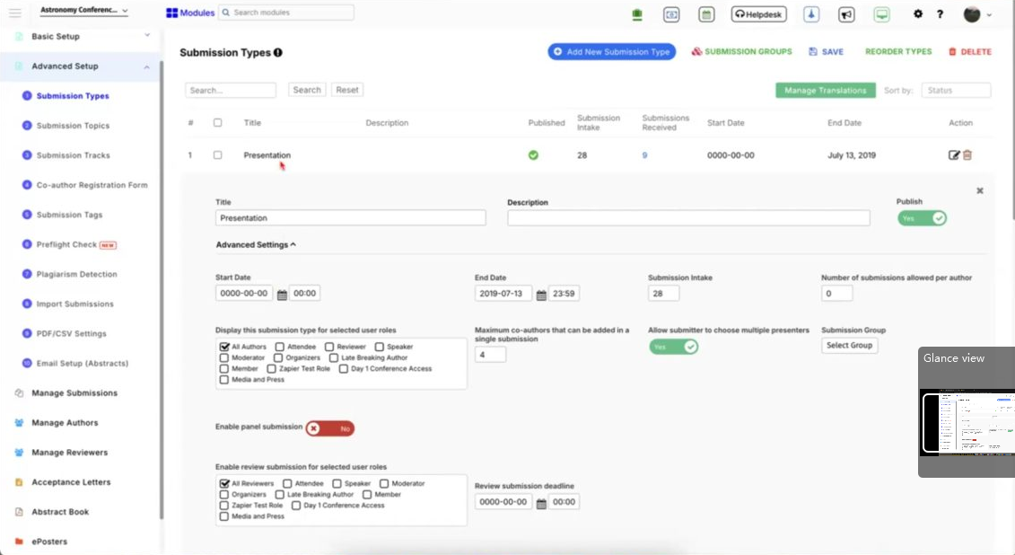
Dryfta can support the administrative path around these requirements. Organizers can configure submission questions by type, track or topic, collect poster files and supporting material, set deadlines and ask accepted authors for final presentation files. The team can use those fields to collect the poster, its accessible alternative and the destination link as separate deliverables.
The platform does not decide the accessibility standard or certify a poster. The conference and its accessibility reviewer still define the requirements, inspect the files and approve any exception. Dryfta’s role is to keep the requested material, status and communication connected to the correct submission and presenter.
To discuss a poster-submission and presenter workflow for your conference, request a Dryfta demo.

Questions conference teams ask
What makes a scientific poster accessible?
An accessible poster presents its essential information through readable text, clear structure, sufficient contrast and cues that do not depend on colour alone. Figures have meaningful labels and descriptions. The conference also provides an accessible digital alternative and a reliable way to reach it. No single font choice, checker or template can guarantee access for every reader.
What font size should an accessible research poster use?
There is no universal size because poster dimensions, viewing distance and venue conditions vary. The conference should set a tested minimum for its format and review an actual-size proof. Body text intended for a large poster should not copy a 12-point manuscript convention. Check headings, labels and captions as carefully as the main text.
Does a scientific poster need alt text?
Images in the digital version need text alternatives that convey their purpose. A complex chart may also need a longer description or data table. If an author supplies the poster as one flattened image, a short alt attribute cannot carry all its research content. Provide a structured text, HTML or properly tagged document alternative as well.
Is a PDF copy enough for accessibility?
Only when the PDF contains real text, a logical tag and reading order, descriptive headings, usable links and appropriate alternatives for figures, and when the team has tested it. An image-only PDF repeats the access problem in digital form. Structured HTML may offer a simpler responsive alternative when the team cannot produce and verify an accessible PDF.
How should organizers check poster accessibility?
Combine automated checks with manual review, an actual-size print test and a live test of the QR code or short link. Check the poster, the digital alternative and the route between them. Return specific corrections before printing and ask a qualified accessibility reviewer to validate the final requirements and any high-risk exception.
For online-only display and session logistics, use the separate guide to planning a virtual poster session.
