


Accessibility, when installed only superficially into your event management experience, is merely an oxymoron. It claims to be within reach for all but still falls short in important places, ultimately rendering it futile. This is the story of many abstract forms today. Designers believe they have created it with accessibility and PwD in mind, but only upon use do they realize that there are gaps leaking through. Abstract submission form accessibility is, therefore, only complete when you’ve tested it thoroughly before it goes live for the public. It is certainly not a great feeling for individuals to realize halfway through filling your abstract submission form that the form fields never truly accounted for their special needs.
Is Your Working Form Still Shutting People Out?
A submission portal can get the green light through multiple internal reviews and still stand as inaccessible at the end. This is very much a reality and, unfortunately, happens much more frequently than the event management industry is willing to acknowledge.
Because an abstract form loads correctly, accepts a title and an abstract and processes a payment without a hitch, most teams call it finished. Yet a keyboard-only author might never reach the Add Co-Author button, since focus can slip past a control that a mouse click would land on instantly. An error might then appear only as a red outline around a field, telling a sighted mouse user everything while telling a screen reader user nothing.
In yet another scenario, several form fields may announce themselves as nothing more specific than ‘Select,’ so the person listening has no idea what is actually being chosen. A standard, superficial functional test catches none of these evident inconsistencies in abstract submission form accessibility.
On Naming What Abstract Form Accessibility Actually Means
An abstract submission form earns the word accessible when authors with different disabilities and different assistive technologies can understand it, move through it, complete it, correct their own mistakes and submit it without hitting an unnecessary wall. Put simply enough, though, that definition still needs breaking into questions a team can actually test against.
| Question | What It Tests |
|---|---|
| Can the author perceive the question? | Labels, instructions, contrast and structure |
| Can the author reach and operate it? | Keyboard access, focus order and control behavior |
| Can the author understand what is expected? | Instructions, required states and word or file limits |
| Can the author recover from mistakes? | Errors, focus movement and correction guidance |
| Can the author finish the full journey? | Uploads, save and return, submission and confirmation |
Each of these five questions lines up with one of the test rounds that follow, so a team stuck on a particular question already knows where to look for the fix. Knowing what to test matters less, however, without a plan for how and when that testing happens.
Planning the Test Before Touching the Form
Skipping a plan tends to produce a familiar outcome. A handful of obvious issues get patched, while the one form variation nobody opened stays broken until an author finds it live. A simple test sheet, built before testing starts, heads that off, and each form version can then carry its own result, owner and retest status once a fix lands.
| Field | Example Value |
|---|---|
| Form or version | Oral abstract v3, or Student award form |
| Environment | Chrome on Windows, Safari on macOS, one representative mobile device |
| Method | Automated, keyboard, screen reader, zoom or mobile |
| Result | Pass, fail or needs review |
| Severity | Critical, high, medium or low |
| Owner | Form admin, developer or product support |
| Retest | Date and pass or fail outcome |
Round One: Automated Scanning and the Visual Basics
An automated scanner such as Lighthouse, axe or WAVE offers the quickest route to a first batch of machine detectable defects, catching missing field names, some label problems, contrast failures and structural or ARIA errors. Every flagged result still needs a human look afterward, though, since a scanner cannot judge whether an error message actually explains anything useful.
A clean scan should be read as a starting line rather than a finish line. Whether focus moves in a sensible order, whether an error message helps and whether a task can genuinely be completed from start to finish are all judgments a scanner was never built to make.
This same round is also a convenient point to check the plainer visual details, since folding them in here avoids a repetitive section later. Labels should stay put next to their fields rather than vanishing the moment a field gets focus, and required fields should be marked in a way nobody can miss. Contrast needs to hold up across every state a field might enter, including its error state, while headings should follow an order that actually makes sense and instructions about limits or file types should appear before a mistake forces the issue. Addressing these basics alongside the scan clears the ground for a test no automated tool can run.
Round Two: Keyboard Access and Focus
Setting the mouse aside and moving through the entire form with Tab, Shift+Tab, Enter, Space and the arrow keys surfaces a different kind of problem than scanning does, because the real question shifts from whether a control exists to whether it can actually be reached without a pointer. Merely reaching something is only half the job, since the sequence in which focus travels and whether that focus stays visible carry just as much weight.
A solid keyboard pass confirms that every field, button, link, checkbox, dropdown and upload control responds, and that focus travels sensibly from the title through submission details, authors, content, uploads and the Submit button at the end. Its indicator should remain visible the whole way through, custom dropdowns and dialogs should open and close without a mouse, and functions such as Add Author, Remove Author, Save Draft, Preview and Submit should all answer to the keyboard alone. Nothing should trap a keyboard user inside a component with no visible way out, and every modal needs an escape route.
Reordering authors deserves its own moment of attention here, since drag and drop cannot stand as the only option if a form allows co-authors to be rearranged. Dragging an item has no natural keyboard equivalent unless the form supplies one, such as a Move Up or Move Down control beside each name. Verifying keyboard operability clears the way for the next question, which is whether the same journey holds together when heard rather than seen.
Round Three: Labels, Groupings and the Screen Reader
Working through the form with a realistic screen reader combination, such as NVDA on Windows or VoiceOver on macOS, means completing an actual submission rather than skimming the page from top to bottom. A test that never attempts a real submission will overlook precisely the problems that matter most.
At each point along that task, a tester should be able to answer a set of questions without hesitation. Does the announcement for a field say something useful, such as “Abstract title, required,” rather than the nearly meaningless “Edit“? Are grouped choices such as presentation formats read out as a coherent set instead of a scattered list of options? Does an instruction about a word limit, a file type or a blind review requirement arrive at the right moment? When a conditional field appears, such as a student award question triggered by a checkbox, does the change get announced at all? If an error occurs, is it flagged immediately and tied back to the exact field that failed? And once submission succeeds, does a clear heading and a reference number confirm it?
Answering all six of those with confidence proves something neither a scan nor a keyboard pass can confirm on its own, which is that the form communicates meaning rather than merely offering structure. From here, attention turns to the pieces that set an abstract form apart from an everyday contact form.
Round Four: Stress Testing What Makes Abstract Forms Different
Abstract forms diverge sharply from general contact forms right around here, and this round tends to surface the issues that generic accessibility guidance never anticipates.
| Component | Practical Test |
|---|---|
| Conditional logic | Trigger every branch, and confirm new fields are reachable, understandable and removed from interaction when hidden |
| Word or character limit | Confirm the limit is explained, the counter works and exceeding it produces useful feedback |
| Rich text editor | Test keyboard access and toolbar behavior, and confirm the task remains completable without complex formatting |
| Co-authors | Add, remove and reorder several authors, and confirm repeated controls carry meaningful, distinguishable names |
| Affiliations | Test multiple affiliations and institution selectors with both keyboard and screen reader |
| File upload | Choose, upload, replace and remove a file, then deliberately trigger an invalid type, an oversized file and a failed upload |
| Declarations | Confirm required checkboxes and disclosure questions are labeled and grouped correctly |
Breaking the form on purpose belongs in this round too, since authors will eventually stumble onto validation problems regardless, and a tester finding them first costs far less. Triggering a missing title, an invalid email, an abstract that runs over its limit, an unsupported file type, a missing declaration, a missing presenting author and an incomplete conditional field all test whether the error handling actually helps rather than just existing.
A passing result means the author knows exactly what failed, where it failed and how to fix it, since a red border by itself never clears that bar no matter how bright the color runs. With the form’s academic specific pieces holding up under pressure, only the full journey from start to finish remains untested.
Round Five: Following the Complete Author Journey
Accessibility does not wrap up once the final field behaves correctly, because authors move through a form as one continuous journey rather than a set of disconnected fields. This round follows that journey from the zoom level an author might rely on all the way to the confirmation email that lands afterward.
| Journey Point | What to Verify |
|---|---|
| Zoom and reflow | Labels, instructions and buttons remain visible and usable at increased zoom without overlapping |
| Mobile and touch | Tap targets, the on-screen keyboard, long text entry, uploads, modals and errors all remain workable |
| Save draft | Values save correctly and the saved status is understandable |
| Return later | A returning author can locate the draft, continue and submit without losing context |
| Session timeout | The warning and recovery process are understandable, and entered work is not lost unexpectedly |
| Deadline state | Time zone, closure messaging and late or expired states are communicated clearly |
| Confirmation | The success message, reference number, next steps and confirmation email are all accessible |
Turning Accessibility Findings Into Fixes
Every issue uncovered during testing needs an owner and a specific retest scheduled before anyone calls it resolved, since a developer’s claim that something has been fixed only opens the verification process rather than closing it. The original failure should reappear, or fail to reappear, under the same form state, the same device and the same assistive technology that first caught it.
| Severity | Launch Treatment |
|---|---|
| Critical | Blocks submission or makes a core task inaccessible, and must be fixed before launch |
| High | Makes a major task very difficult or hides important information, and should be resolved before launch wherever possible |
| Medium | Leaves the task possible but confusing, and should be fixed or documented with an immediate remediation plan |
| Low | A minor usability or accessibility improvement, which can be tracked and scheduled for a later update |
Ask yourself this important question. The answer to this will point out inconsistencies in abstract submission form accessibility, if any.
Can an author complete my entire abstract submission form without running into an accessibility blocker along the way?
A call for papers should wait if the answer comes back as no for this question. Any issue, when marked critical or high, regardless of how close the planned launch date has crept in, should be temporarily paused and rectified.
Where Dryfta Comes Into The Picture
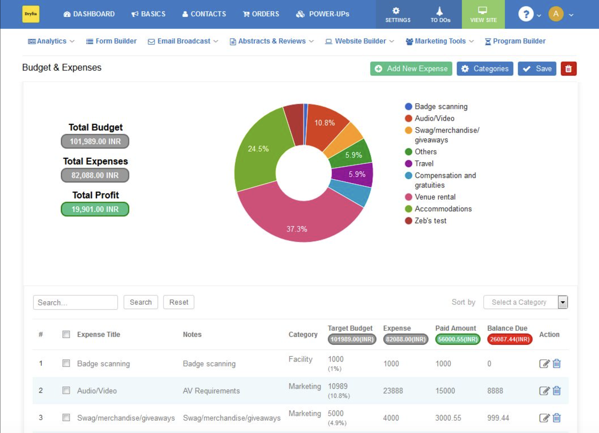
Dryfta gives conference teams configurable abstract forms, multiple submission types, conditional fields, file uploads, required fields, structured sections and self-service workflows built for authors. Those tools make it possible to build the kind of layered academic form this guide has been testing throughout, covering oral, poster, panel and award submissions with their own branching logic.
None of that capability removes the testing responsibility from the organizer, since the specific questions being asked, the instructions attached to each one and the logic tying them together stay entirely in the organizer’s hands. A capable platform opens the door to an accessible configuration, though walking through that door still depends on the choices made on the other side, and two organizers running the same software can end up with forms that behave very differently once real authors arrive.
The sequence worth following stays simple even so. Configuration comes first, then the organizer runs the tests laid out across this guide, then any issues found get corrected, then the full journey gets retested, and only after all of that does the call for abstracts actually launch. A configurable platform still leaves the last three steps squarely with the conference team, and shortcutting them reintroduces the same barriers this guide has spent its length describing, no matter how well built the software underneath happens to be.
A Compact Abstract Submission Form Accessibility Checklist Before Launch
Here are 14 areas to test meticulously prior to launching your event to ensure the highest standards of abstract submission form accessibility.
| Test Area | Minimum Check Before Launch |
|---|---|
| Automation | Run a scanner and manually review every flagged finding |
| Keyboard | Complete the entire form without touching a mouse |
| Focus | Confirm a logical order and a visible focus indicator throughout |
| Labels | Confirm every field carries a meaningful, persistent label |
| Instructions | Confirm limits and formats appear before the author needs them |
| Dynamic fields | Confirm conditional fields are discoverable and usable when they appear |
| Co-authors | Confirm add, remove and reorder all work accessibly |
| Uploads | Confirm select, replace, remove and error recovery all work |
| Validation | Confirm errors identify the problem and the correction needed |
| Screen reader | Confirm the full author journey can be understood from start to finish |
| Zoom and mobile | Confirm no overlap or blocked controls appear at any size |
| Save and return | Confirm the draft workflow remains understandable |
| Confirmation | Confirm the success state and email are both clear |
| Retest | Confirm every critical and high severity failure has been retested |
Abstract Form Accessibility: Is It Truly There?
A team should be able to answer a short list of questions with real confidence before a submission portal opens to the public.
Can every author reach every single field on the form? Does every question make sense once it reaches them?
Can the whole task be completed without ever touching a mouse?
Does a mistake come with a clear way back rather than a dead end?
Can co-authors be added and files uploaded without hitting a wall along the way?
Does saving a draft and returning to it later preserve everything an author already entered?
And once submission goes through, does the author actually know it worked?
A form that has not been tested against every one of those questions is not ready for the people who are about to rely on it, regardless of how close the launch date has already crept.
At Dryfta, we have remained committed to abstract submission form accessibility for years and years. Our abstract management system (AMS) has been purpose-built with the diversity of individual capabilities and shortcomings in mind. No shortcoming has to compromise the pursuit of knowledge should we not allow it to. This is precisely our vision here at Dryfta. To experience a complete demonstration of our event management software, please sign up for a free demo today.
Frequently Asked Questions (FAQs)
What makes an abstract form accessible?
A form earns that label when authors relying on different disabilities and assistive technologies can perceive every question, reach and operate every control, understand exactly what is being asked, recover cleanly from a mistake and complete the entire submission journey without hitting an unnecessary barrier.
Which WCAG version should organizers use?
WCAG 2.2 stands as the current W3C Recommendation, and it offers the most current baseline available for testing a form, though organizers should still check whether their institution or jurisdiction carries a specific legal or contractual requirement that reaches beyond that baseline.
Is Lighthouse enough on its own?
Lighthouse and similar tools such as axe or WAVE catch a meaningful share of machine detectable issues, yet none of them can judge focus order, the usefulness of an error message, dynamic behavior or whether a task can genuinely be completed, which is why manual and assistive technology testing still belong alongside any automated scan.
How should a form be tested using only a keyboard?
The entire form should be completed using Tab, Shift+Tab, Enter, Space and the arrow keys, while paying attention to whether every control can be reached, whether focus travels in a sensible order and whether its indicator stays visible the whole way through.
How should a form be tested with a screen reader?
A tester should complete the full submission task using a screen reader such as NVDA or VoiceOver rather than simply reading down the page, confirming along the way that fields, groups, instructions, dynamic changes, errors and the final confirmation are each announced clearly.
Are placeholders enough as labels?
Placeholders disappear the moment an author starts typing, and many assistive technologies never treat them as a persistent label in the first place, so a visible, permanent label still belongs on every field even when a placeholder is also present.
How should errors be made accessible?
An accessible error names the field that failed, explains what went wrong and describes how to fix it, and assistive technology should announce all of that rather than leaving color to carry the message alone.
Does accessible software guarantee an accessible configured form?
A capable platform can support accessible configuration, but the organizer’s specific questions, instructions, logic and content ultimately decide whether the finished form holds up, which is exactly why testing the configured form remains necessary no matter which platform sits underneath it.