 Source: socialsciencespace.com
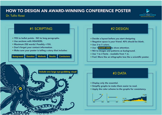
Poster designing is an all-embracing approach to display your activeness and hard work, notably if you are just springing into the research. They are much headache-free and less complicated way to deliver your actual message to the audience when compared to the oral presentations. However, it still presents valuable practices and excellent networking opportunities at expressing your obligation.
☑ #1 Pick Text in the Form of Poster Content Smartly
The data you can include around on a poster should need to be limited. Select an individual research viewpoint that you believe can demonstrate comprehensively in a small amount of content & graphics and concentrate on that only.
☑ #2 Utilize Microsoft PowerPoint to Set Out Desired Poster
The primary concern is that your word file should be transferred undeviatingly to the printers to get it printed when you are done with designing part. Pick a layout or design that perfectly suits the area allotted to you by the organizer of the poster session.
☑ #3 Compose Layout Flow
Your poster needs to be noticeable & seems natural to the user. Once you are done with the sections and information to be included in the poster, you need to choose a proper layout to arrange all the things. Always organize your content in logical manner in order to make it effective. Use a rough draft method to decide the layout.
☑ #4 Eliminate simple, classic bugs
There are some common mistakes seems to be repeated everytime. These mistakes should always be taken care of like avoid the use of over 2-font types, avoid using whacky or bold color schemes, avoid using ALL CAPITAL LETTERS, strictly avoid absurd fonts such as Comic Sans.
☑ #5 Title That Suits Poster the Best
The first sight of viewers falls on the title, so try to make it as informative, relevant, conclusive, and entertaining as possible. Prefer a font type and size that can be easily readable from a distance of around 10-15 feet. A font size of about 60 to 90 point suffices.
☑ #6 Make Poster Visually Appealing
Your eminent title has pulled the viewer’s attention. Now, the viewer thinks, “How much time will it need me to go through the entire title?” To retain their engagement, ensure that your poster essentially practices figures & illustrations to explain your story—and withdraws massive text blocks. Make visually appealing figures and self-informative. The viewers will drop engagement if they find a word rich poster instead of attractive graphics.
☑ #7 Edit Text
Then, go after & again edit it. On a poster, the textual content is the rival. Visitors are required to get into your story promptly, or they will regularly drive, so actively operate to have as small text as possible. Draft the textual content & then move over it repeatedly. Eliminate any stuff that is not needed at all. If you must have textual content, try to create short sentences short and don’t forget to provide around 30% content in the form of bullet points.
☑ #8 Leave Some Space
Don’t overfill your poster packed with data. Unfilled space presents the poster appears easily understandable, quickly approachable and less complicated, which supports draw viewers to your poster. You can utilize blank space to emphasize essential poster components (such., the determination). Less text is good, as they relate.
☑ #9 Get Feedback on Poster
Ask a colleague to have a look at the poster you designed before finalizing it for printing, preferably an explorer who is not intimate with the specific caption area. Take their remarks seriously regarding the poster’s readability, visual appearance, and overall attractiveness. Do work again as per their remarks, if needed.
☑ #10 Remain at Poster & Communicate to People
There’s no point in creating a fabulous poster & confronting in the pub throughout the session of the poster. Remain with your poster & attempt to influence viewers using it. Don’t drop this excellent networking chance. If you are at a convention where you drop your poster up out of the concourse, then set your email location on your poster or/ and bind your profession cards (only if you hold it) to the board of poster. It will enable viewers can reach up with you later on if you are not available across.
Here’s a great article on designing an award-winning poster


