

If you are an academic or researcher who attended an event in 2025 or are an organizer who planned one, you may acknowledge how an effective website is now as important as planning the event itself. And, for obvious reasons, it’s the first point of contact for potential attendees and serves as the primary information hub throughout the event lifecycle.
So, for conference organizers looking to maximize attendance and engagement, a well-made website means business. More recently though, the expectations for conference websites have changed substantially. The increasing demand for user-friendly digital experiences has opened up new opportunities for organizers to connect with their audience.
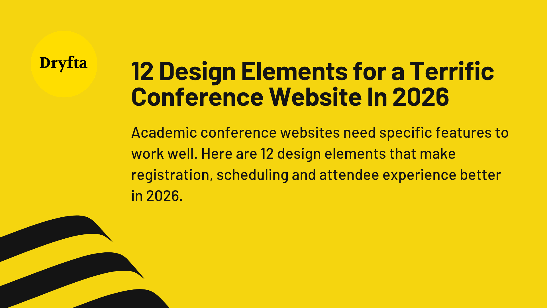
For event planners hoping to host successful conferences in 2026, understanding what makes a website truly functional is a question worth pondering. And in this article, we have all the answers in one place. Here are 12 key design elements that no event planner should miss out on in 2026.
1. Design Clear Conference Branding and Identity
When someone lands on your website, they should know immediately what conference they’re looking at. The conference name, logo, theme and tagline belong above the fold. Too many organizers bury this information below other content, forcing visitors to scroll just to understand where they’ve landed.
Visual consistency across all pages reinforces the conference brand. Typography choices matter. Color schemes matter. The images you select communicate your academic focus and professional standing before anyone reads a single word. Your website is nothing short of a digital venue in itself. Hence, the aesthetic should adequately match the caliber of the event you’re hosting.
2. Design Accessible Date, Location and Venue Information
Nothing frustrates potential attendees more than hunting for basic details.
When is it?
Where is it?
How do I get there?
These questions should have immediate answers on every page.
The header or sidebar works well for displaying dates, venue name and location. Full addresses with map links save attendees the trouble of opening another tab.
If your conference spans multiple days, break down the schedule clearly. Virtual or hybrid? Specify the platform and timezone considerations upfront. Seconds matter here; if someone can’t find the information quickly, they’ll leave.
3. Design a Streamlined Navigation Menu
Conference websites collapse under the weight of overcomplicated navigation. Visitors get confused. They click through three dropdowns and still can’t find the registration page.
A logical menu structure groups related information under clear categories:
-
- Program
- Registration
- Speakers
- Venue
- Submissions
The navigation should stay visible as users scroll. Nobody wants to return to the top of the page every time they need to move between sections. Dropdown menus work for subcategories, but anything more than two levels deep becomes a maze. On mobile, the hamburger menu should be obvious and easy to tap.
4. Design Effortless Registration System Integration
Registration friction kills attendance. Every extra click, every redirect to a clunky third-party site that looks nothing like your conference website, these are tiny annoyances that eventually add up to jeopardize the user experience.
Therefore, integration matters above all else in website design. Attendees should be able to complete their registration without feeling like they’ve left your site.
Display anything money-related upfront and prominently. Things like your early bird rates, student discounts and group pricing should have a prominent spot on your website. The registration button also deserves visible placement on multiple pages.
5. Design a Detailed Program Schedule
Attendees need to understand what sessions are available and when they’re happening. A vague ‘schedule coming soon’ message just doesn’t cut it.
Session titles, speaker names, times, locations and brief descriptions should all be there. The best conference websites let visitors filter by track, day, speaker, or topic. Multi-track conferences, in particular, benefit enormously from grid or timeline views as attendees visualize concurrent sessions and plan their day without much hassle. PDF downloads appeal to people who prefer offline access or want to mark up their schedule with notes.
6. Design Compelling Speaker and Presenter Profiles
People register for conferences largely based on who’s presenting. Your keynote speaker lineup can make or break attendance numbers.
Professional headshots, biographical information, institutional affiliations and links to publications or research give credibility. Keynote speakers deserve special mention and their talk titles and abstracts should stand out from the rest of the details. Some conferences add short video introductions, which personalize the experience and build anticipation.
Speaker information needs to be accessible, either through a searchable directory or organized by session. Forcing someone to click through fifty individual pages to find a specific presenter is poor planning.
7. Design an Effective Call for Papers and Submission Portal
Conferences that accept abstract submissions need to make the call for papers impossible to miss. Deadlines, submission guidelines, formatting requirements, and review criteria belong in the front and center.
The abstract submission portal should be one click away and not hidden behind layers of navigation. Dedicated submission management systems must let authors track their abstracts through peer review, which reduces the flood of ‘what’s the status of my submission?’ emails to organizers.
Acceptance rates also matter to potential submitters. And so do presentation formats. Publication opportunities further sweeten the deal. So when deadlines pass or the call closes, update the site immediately. Outdated information smashes your credibility to pieces.
8. Design Helpful Accommodation and Travel Information
Out-of-town attendees face logistical challenges that residents and locals never have to think about.
Where should I stay?
How far is the hotel from the venue?
What’s the easiest way to get to the venue from the airport?
If you are tying up with a hotel that offers a stay, then your non-native attendees need booking codes and deadline dates listed clearly. Distance from each hotel to the venue matters, as do transportation options. Airports, train stations and public transit routes, all of this information prevents attendees from scrambling at the last minute. Restaurant recommendations for the host city add value, particularly for first-time visitors.
9. Design Attractive Sponsorship and Exhibitor Information
Academic conferences often depend on sponsorships to offset costs and improve attendee experiences. Potential sponsors and exhibitors need a dedicated section outlining available packages, benefits at each level and contact information for the sponsorship coordinator.
A downloadable prospectus makes it easy for companies to review opportunities offline. As sponsors commit, their logos belong prominently on the homepage. Individual sponsor pages work well for major contributors.
Exhibitor information like booth layouts, setup times and technical requirements are both marketing and guidance. This section often gets neglected until late in the planning process, but early attention here can secure funding that makes everything else possible.
10. Design for Mobile-Responsive Performance
More than half of web traffic comes from mobile devices now. Conference websites are no exception and yet many organizers still treat mobile as an afterthought.
Text on the website should be readable without having to excessively zoom in and the buttons need to be large enough for easy tapping. Make sure that your viewers do not need to carry a magnifier. Your forms must be simple to complete on smaller screens and images should scale smoothly and sit appropriately. Page load times matter even more on cellular connections than on desktops.
Testing across multiple devices and browsers before launch can help you catch problems that a desktop-only review misses entirely. A mobile event app is nice but a responsive website is mandatory. Too many conferences invest in apps that hardly anyone downloads, neglecting the mobile web experience that everyone uses.
11. Design Accessible Contact Information and Support
Attendees will have questions your website doesn’t answer. Maybe they have dietary restrictions. Maybe they need accessibility accommodations. Maybe they’re confused about the refund policy.
An email address specifically for conference inquiries should be obvious. Phone numbers are helpful for urgent matters. As fundamental as it may sound, you would be surprised to know that many organizers skip that part entirely.
When you integrate contact forms into the website, you offer an alternative for confused attendees who prefer not to send a customary email. A frequently asked questions section also helps address some common concerns without attendees having to extend them further. The FAQ should also grow as new questions come up during planning and as your attendees get in touch.
12. Design an Updates and Announcement Section
Conference details change constantly as the event approaches. New speakers get added and deadlines get extended. Your venues also occasionally change and you will have to make amends for schedule adjustments.
A news or updates section makes such challenges considerably easier to confront. They keep your attendees informed about the situation without you having to manually apologize and inform hundreds of people.
Therefore, display any recent and significant updates prominently on the website’s homepage. Offering things like an email newsletter that viewers can sign up for lets interested parties receive notifications directly in their inbox as opposed to checking the website repeatedly. It becomes more important as the conference date approaches and last-minute details get finalized.
You Cannot Overlook Website Design in 2026
If you’re organizing an academic conference for the first time, these 12 design elements let you build a sturdy boat on which your proposed event may sail. Some established conferences and organizers might already have several components, but they can still benefit from reviewing each of these elements to identify gaps.
Conference websites also need and warrant maintenance on a regular basis. As an event planner in 2026, you cannot just launch a site and forget about it until next year. The nature of academic conferences continues to change, particularly with hybrid and virtual events. A well-designed website is one of the few entities that appear to remain constant in the event management race.
At Dryfta, we are helping more and more event professionals adapt to the new reality of responsive website designs. If you want to outdo yourself in 2026 in terms of your event’s overall presentability, logistics and effectiveness, reach out to us. Sign up for a free demo today and take the first step to a brand new year of incredible events.